Layout Improvements
Summit 2024 Improvements
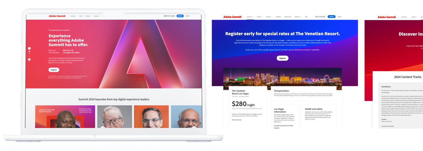
The biggest improvement overall is to make sure that information is well organized and given lots of space. The goal was to make everything more legible and less overwhelming.
Taking up space
To improve from last years design, I focused on making sure images took up space on the page to create a more engaging and open feeling.
Giving speakers priority
Forcing so many headshots and information within the bento grid on last years homepage made the entire page feel stuffy. To solve for that, there's a carousel with a static image of the feature speaker and a toggle to allow a quick view of other speakers. There is also an entire speaker page where users can go through each headliner and learn more about them.
Pushing users to other pages
Further down the page, the user is being guided to check out upcoming sessions, preconference trainings, and learn about how to join the online conference. With a better balance of information, there is also tons of space to highlight sponsors and images of past adobe conferences to get users excited about what to expect at Adobe Summit 2024.