
My Role
UX Designer
Tools
Figma
Platform
Web
Description
While at DeutschLA, Taco Bell reached out asking for help with their checkout flow. They noticed a 20-30% drop off of user’s once they reached checkout and mentioned they wanted to improve their overall branding to be more ADA compliant. I was tasked with redesigning the checkout screens/flow to solve this problem.
Skills Used
UX/UI Design, Design System, UX Research
Taco Bell noticed a 20-30% drop off of user’s once they reached checkout and mentioned they wanted to improve their overall branding to be more ADA compliant.Constraints: Dev mentioned they were understaffed and working on moving the site from one platform to another, aka don’t make any complicated changes. On top of that we were only given two weeks to redesign the checkout floor.
To find out what users think about the current flow, we hit up the Test Kitchen, Taco Bell’s user testing group. Here’s a few excerpts from what they’ve said.

Before jumping into creating new flows, it was important to take a look at some of Taco Bell’s competitors. The interesting thing about GrubHub, Uber Eats, and Doordash are that they all deliver Taco Bell.

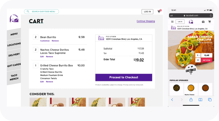
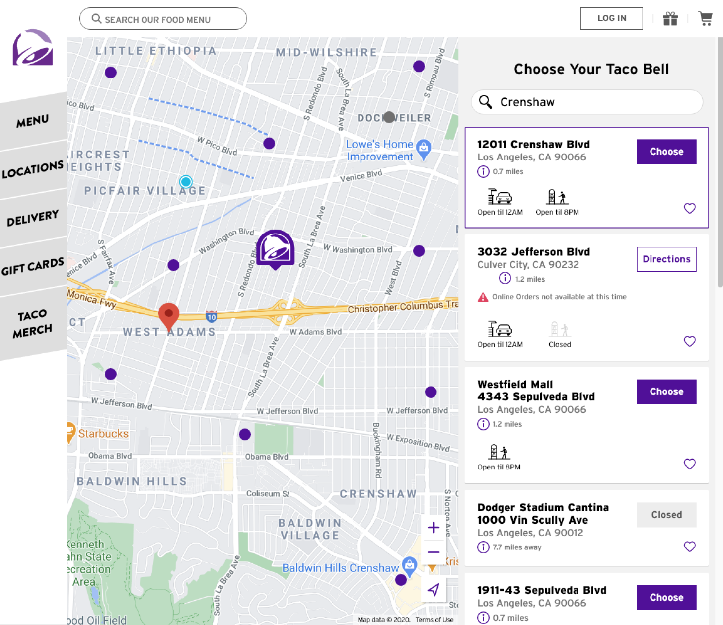
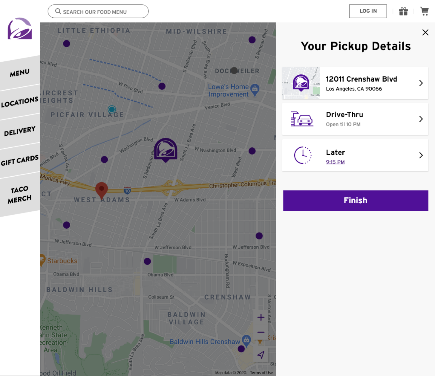
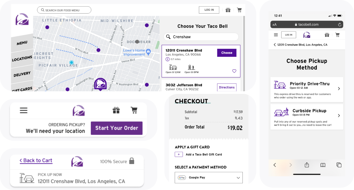
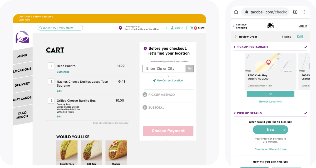
It was inconvenient for users to get to checkout, select a location, and notice that their total has changed. Checkout requires getting a lot of information from customers, it made sense take the customer through baby steps, compared to how it currently lays out all of the information on one page.
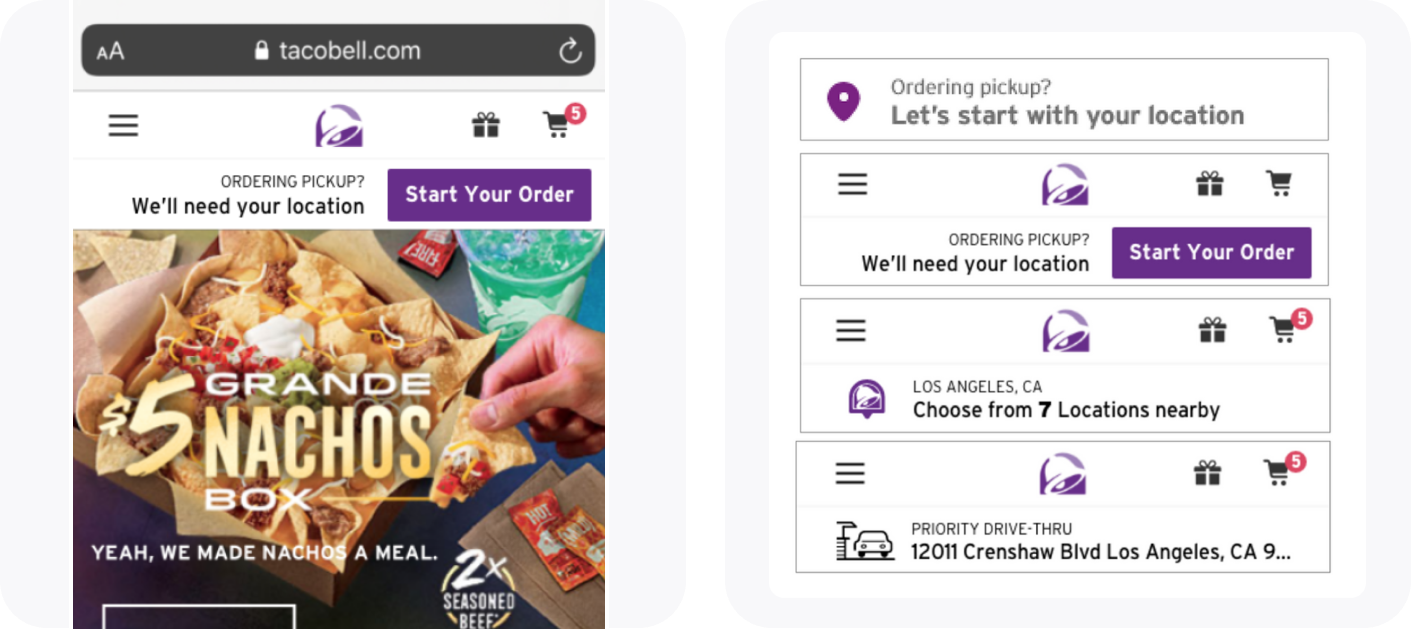
Location Module: It was inconvenient for users to get to checkout, seclect a location, and notive that their total has changed. By prompting location sooner, it takes the shock away from the user.
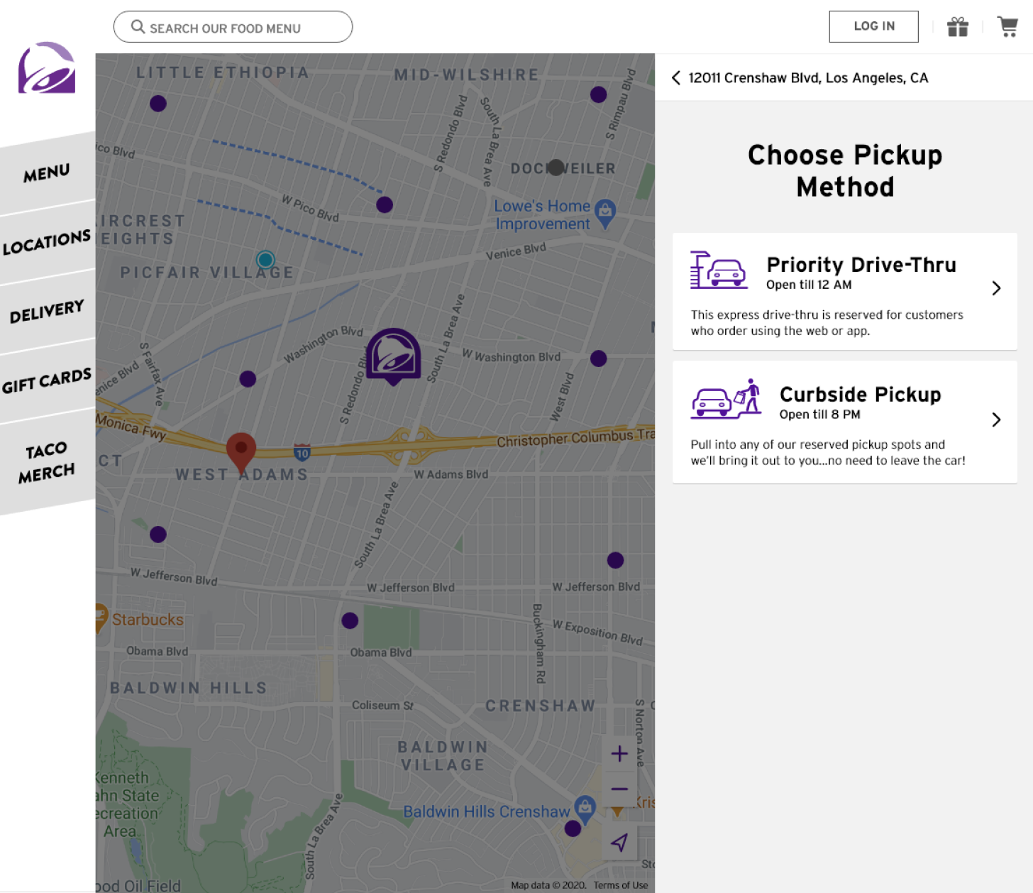
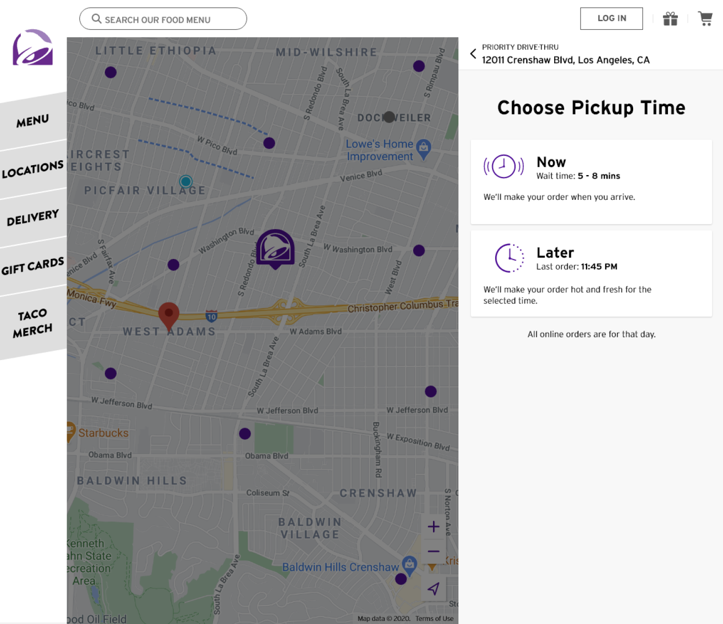
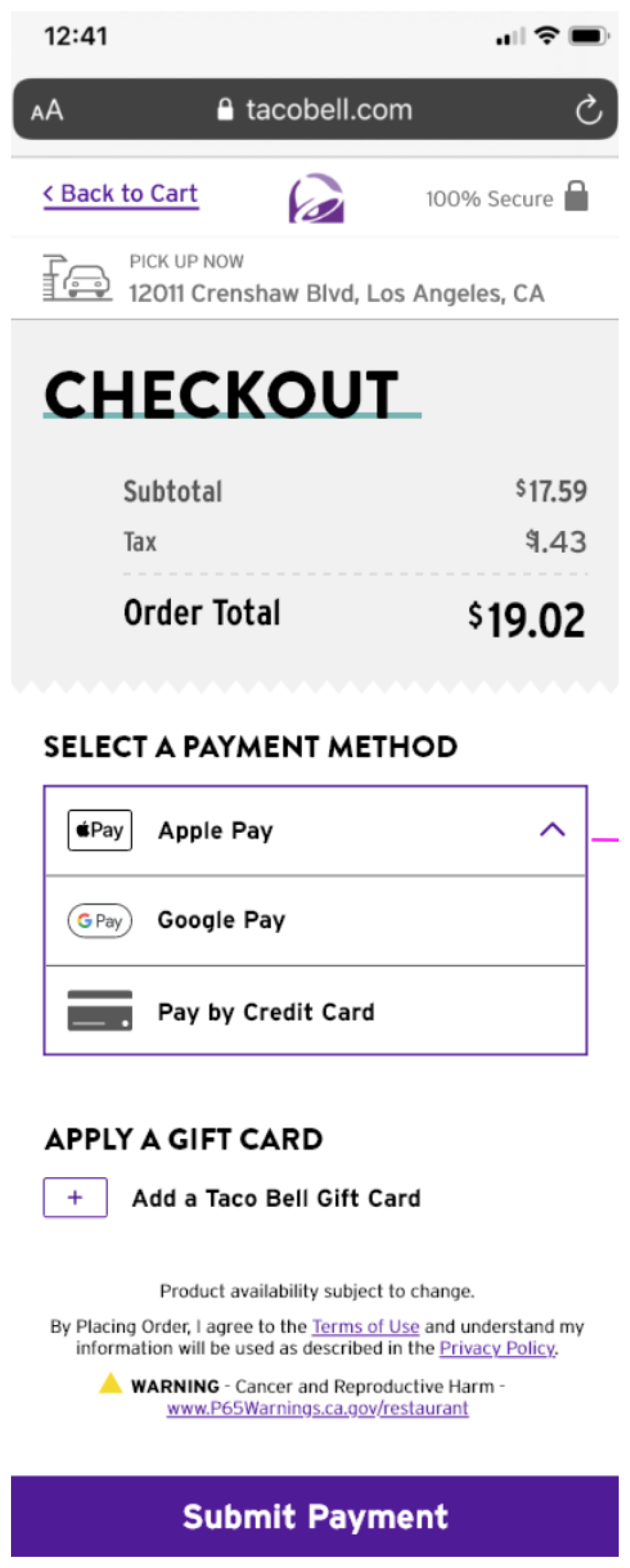
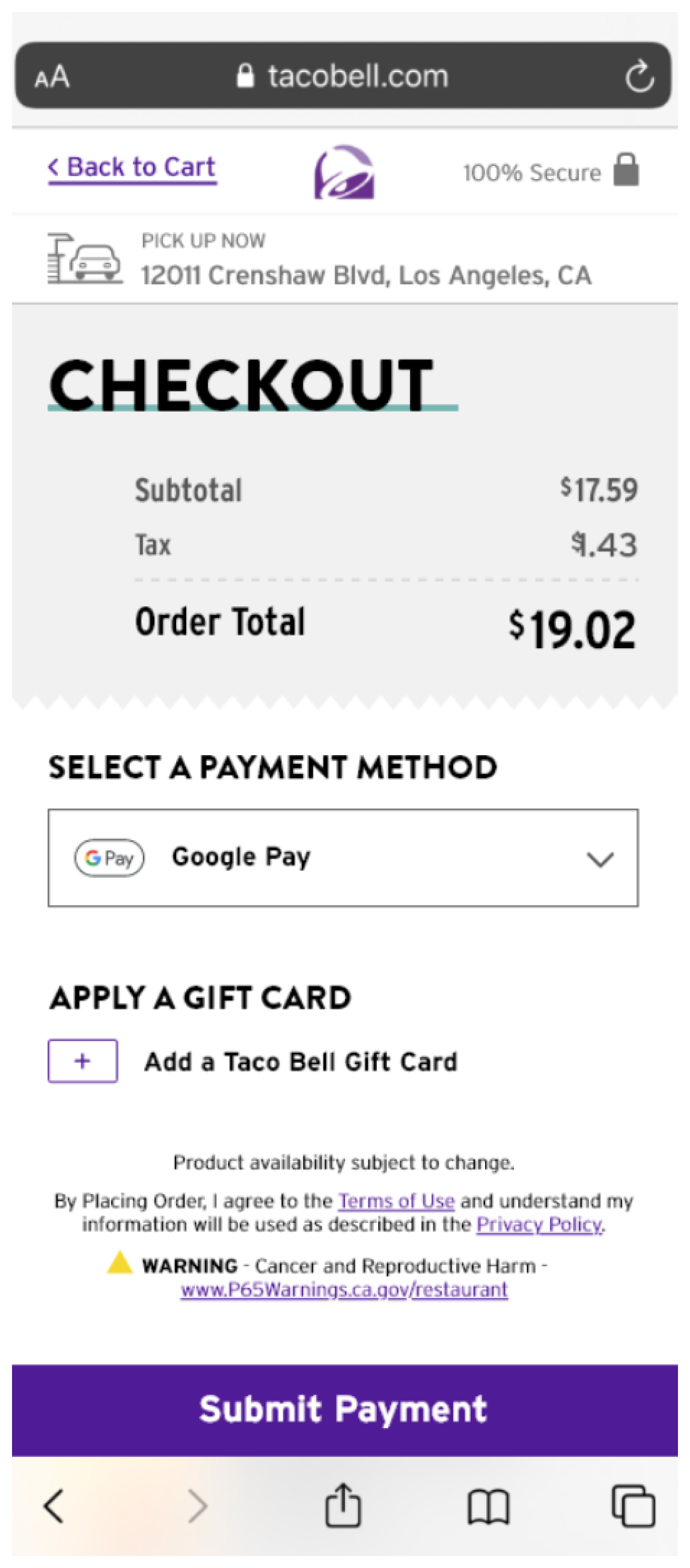
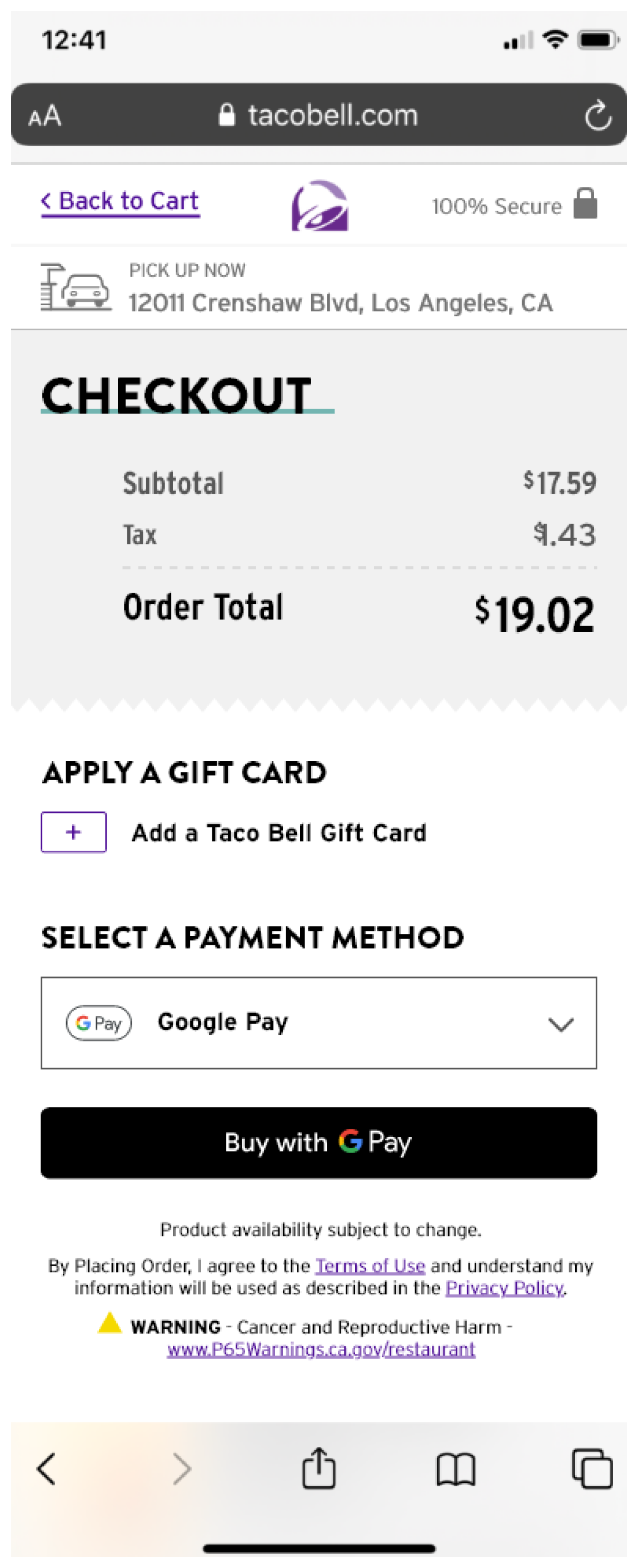
Breaking up the checkout flow: Checkout requires getting a lot of information from customers, it made sense take the customer through baby steps, compared to how it currently lays out all of the information on one page.
Updating the design system: Taco Bell is using different branding for all of its products within its ecosystem. That’s just not a smart thing to do. While working on the checkout, we started to create a ‘design system lite’ that would be applied to this flow but has plenty of potential to grow into the rest of the ecosystem.