LG.png)
ES Chat
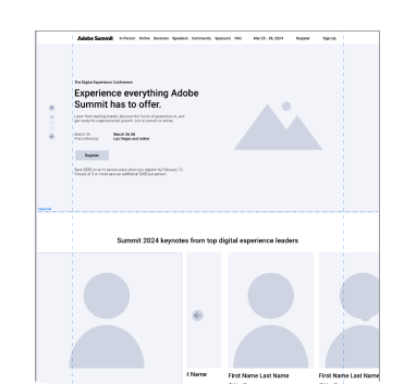
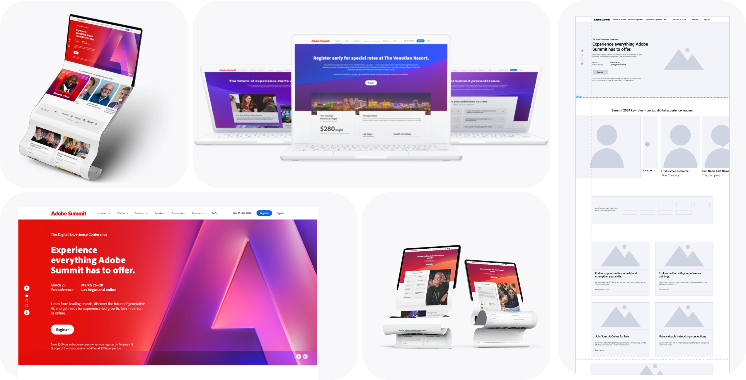
Designing for Adobe Summit 2024.
My Role
UX Designer
Tools
Figma
Description
For Adobe, I was tasked with redesigning the marketing pages for their online/in-person keynote event.
Skills Used
Layout Design, UX/UI Design, UX Research
In comparison, Summit 2023 wasn't on par with Adobe MAX.
Visually, page layouts for Adobe Summit 2023 felt outdated and not as engaging as Adobe’s creative conference Max. Adobe Summit consists of a lot of information that can feel overwhelming to users. There are hundreds of sessions and with this being an online and in-person event, things can get a little hectic.

Looking at last year's Adobe Summit 2023 layout in order to find places where improvements can be made.
What can we learn from looking at last years layout?
The bento grid style doesn't work well here
Bento grids are great for organizing content into sections, but it feels like it does more harm than good here. There is too much visual information being squeezed into small sections and starts to make the page feel overwhelmed.
Visual Hierarchy feels off
This website feels very center heavy. Its difficult to tell what information is actually important and a lot of the important information is sectioned off in the center of the page. The page fold stops just below the headshots of the speakers and makes them feel like floating heads without much context.
There's just too much information up front
With so much trying to fit on one page, it just feels a bit overwhelming. There are a lot of photos and long lines of text and none of it brings out Adobe's creative and engaging nature.

Understanding the site flow
Adobe can expect around 12,000 people to attend the in person event and 20,000+ online viewers. Creating a site map allows me to have a better understanding of site flow and where pages have been added in comparison to last years event. It helps to understand how user's may move throughout the website and get a better understanding of how users might move through the site.

Making information more accessible.
With so much important information, how do we allow users to see all the necessary information, but keep them from being overwhelmed?
During this project, I focused a lot on balancing information. I played with different UI elements that allowed me to hide and show information.


%20-%208.png)
%20-%201.png)